
1.In what ways does your media product use,develop,or challenge forms and conventions of real media products?
Images
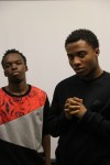
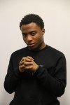
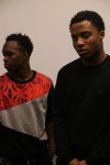
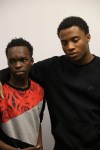
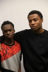
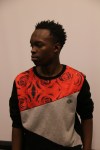
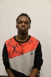
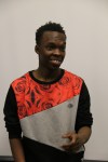
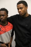
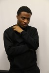
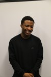
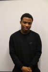
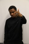
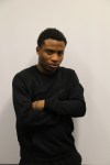
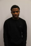
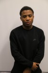
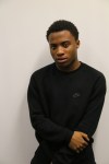
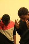
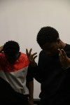
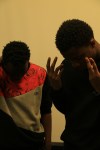
For my image i used a medium close up shot of me for my magazine cover, my feature page and also to go on my contents page.the reason why i used that type of angle for my magazine is because I felt like that was right for a magazine cover. the white wall was also something i wanted in the background because it makes the model stand out in the magazine and also to the audience. i also didn’t have to edit any of the pictures because the background color was good enough and there was nothing disrupting the image. i also used a picture of my friend to be in the contents page to add more of a feel to the magazine so it wouldn’t look like it was only about the artist on the front cover. i roughly used around 4 images which was the amount i was supposed to use for the whole magazine and i also could’ve used more. one challenge i did have to face was choosing the right front cover image. this was because some of the pictures that were taken would cover up some of the writing in a certain area or the position wasn’t correct.these were the four images i used:


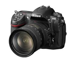
The camera i used was the nikon d300. i thought it was a good choice to use to use this camera because i was very good at using it plus i was used to the settings. it was also a different choice because many people used a canon to take their pictures for their magazine. i wanted to take several of pictures with this camera to get the right picture so i would be more satisfied with it.
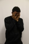
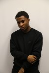
These are some of the draft pictures i took but wasn’t in my final piece:


Mast Head
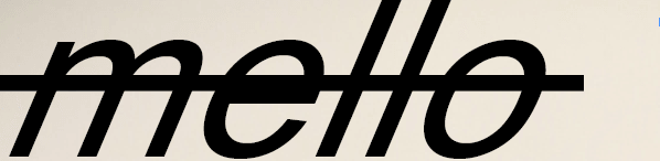
The image above is the Mast head for my magazine front cover. the design is different compared to other types of Mastheads because of the line going through the word which makes it look different than any other type of Masthead. one of the challenges i had to deal with was trying to find the right size for the word and the right font to use so it wouldn’t be out of touch with everything else on the front cover. the mast head is placed on the top right of the page. the type of font that was used is Arial and due to its size being big (120pts) it gives it more of a bold look to the word.
Page Design
While i was creating my designs for my page, i was focusing on the colors i was going to use. the colors are very important in a magazine because it makes the words and design more clear and much more adjustable to read. for the contents page i used a mix between black and white colors. The background is mostly black while the text is in white to be clearer to read.
2. how does your media product represent particular social groups?
pictures of the type of people im targeting:
lifestyle- the type of the audiences lifestyles are based around music. they listen to music on a daily basis and some are music fanatics. they also have debatable discussions on current music trends . The model on the front cover also shows the type of brands and clothing they wear. Nike is a very popular brand with rap artists as they wear it in music videos and on a day to day basis. other brands like adidas and puma are also worn alot by many people.
Interests: Music is the only thing they look up to. music is always in their ears,music is where they go, and music is what they worship.
- Type of people/emotion/behaviour:
- Self educated
- Want to better the society
- always want to learn new things
- Big Headed
race- Mellomag is mostly based around black culture and represents it in a positive way. The magazine talks about race in Hip Hop and also how the black african american community are very dominant in the Hip Hop and Rap industry. The social group that do read the magazine are mainly black people and compared to the black race,a small amount of other cultures read the magazine. its a way for many artits like their kind to express how they feel and their full thoughts and beliefs. This is mostly becuase rap was brought up around a black community in the past but now it has also turned into a multicultural genre with many new artists from different areas and countries all coming together or individualdy making music. this makes MelloMag available for anyone and also fits in most catergories for the audiences type.
costume- The model that was used in magazine is a reflection of what people from the genre and what they wear in our generation like Nike,Adidas etc which are based around street wear. if we go more further into the genre many artists like to have accessories for example, chains,cars,alot of cash and more. they like to dress to impress with their latest clothes and all sorts. The type of clothes they wear feels like an imprint of who they are as a person and who they are represented as to their friends and the people around them
The type of group i am targeting:
- Age-16-25
- Motivators
- self employers
- believers
Mellomag represents the style of Rap and Hip Hop in many ways. It gives the Hip hop and rap community an update on whats going on in the community,new music and up and coming artists
Evaluation Question 3 : What kind of media institution might distribute your media product and why?
When ill be ditsrubiting my magazine, the magazine will be distributed to many main stream companies and will also be on indepent companies aswell. This is because the magazine deserves a large audience as it does fit in to many genres like Hip hop and RnB. Due to my magazine not being so mainstream,me distributing it to bigger companies would be the best option although, it may be more likely to be distributed by independent companies.
Social media: The magazine will also be on social media websites and platforms like music websites so it will be available for ordering. It will also be on soundlcoud and podcasts to listen the audio copy with interviews etc.

retail stores: The magazine will be selling at retail stores in the supermarket and in corner stores. this would be a great source to sell my magazine as it would be brought physically. my magazine will be also selling at popular events/shows/concerts and events


bauer media: Bauer Media Group is a European-based media company, headquartered in Hamburg, Germany that manages a portfolio of more than 600 magazines, over 400 digital products and 50 radio and TV stations around the world. The media company owns magazines like Q and Kerrang and many others.
![]()
independent distrubtion advantages: the advantages of being distributed by an independent distribution is that the distribution would get all the credit for their self work and they would be able to connect to the audience much easier because it will start off as a small magazine. also they would be able to recieve a wide audience by the connecting with the audience more and them stating their opinions to get it some publicity.
independent distrubtion disadvantages: the disadvantages of distributing the magazine with independent media companies is that the magazine wouldnt get alot of attention. this is because many independent comapanies are not as big as the mainstream companies with have a much bigger audience. another disadvantage would be how many people would know about the magazine and the accessibility of the maagzine becuase it would be harder to get than if it was in big retail stores (mainstream magazines)
mainstream distribution advantages: The advantages of a mainstream distribution is it would help me get my magazine across the globe due to the popularity of these distrubutions. it would also reach a much wider audience than if it was an independent distribution, retail stores would also feel much more comfortable with selliing the product aswell.
mainstream distribution disadvantages: there are also many disadvantages with a mainstream distribution. if i was going to be with a mainstream distribution it would have to have the requirements and it would have to be obliged with their rules. if theres something on the magazine that cannot be published with the distribution it may have to be taken down. although the magazine would reach more people it wouldnt be authorised and would have to be suitable for the distribution to put out for the audiene.
Printed and Digital: As we all know printed magzine sells are declining massively over the years. this is because the current generation is mainly on social media and on websites. this is why many of the mainstream magazine companies like the guardian have decided to go digital first to focus more on their online magazine but still sell printed magazines.
Digital platform (Best choice) Focusing more on the digital platform with the magazine will reach to more people because many people dont buy physical copies anymore. it has been statisticly shown how the amount of copies been selling has declined by 50% in the past 10 years and ho many poeple in this generation are mostly on social media.
Evaluation Question 4:Who would your audience be for your media product?
Mello Mag is mostly focused on teenagers and also young adults(16 to 23). its a multicultural community but more of a black african community. We are focused on giving the younger generation freedom and enjoyment to also be positive.
Type of music they like: the music they like is rap mixed with other genres like RnB and Hip Hop. The music is mostly based around positivity mixed with many artists talking about their past and memories while the listener an relate to the lyrics
types of clothes my audience wears:
Hairstyles:
Low cut (waves) Dreads/Twists


Evaluation Question 5:How did you attract and address the audience?
Promotion: one of the ways i attracted my audience was by doing promotion. by me doing promotion, this would attract the audiences attention to look at the magazine and to also know about it too. i used some social media applications like instagram and others like tumblr and making leaflets to share out. social media is also a good platform to keep people updated about the latest news
images: the images were very important in my magazine. I used medium close up images for my front cover,feature page and contents page. this would give the artist most of the attention as its about the artist. i used a plain background for images so the artist would stand out more
The colors i used was mostly black to represent the background. i also used a mix of white and some of blue text in the magazine. Another thing that will attract the audience is the taglines,fonts,titles, and mastheads. i tried to make it clear as possible so the reader would feel more interested to read the magazine
examples


Evaluation Question 6:What have you learnt about technologies from the process of constructing this product?
In this video I explained some of the issues I experienced with in the magazine and some things I had to manage with.
At the start of the year it was hard using the programme tools to make my programme. as i started to use the programmes more to make my magazine i was more familiar when using the editing tools the two main programmes i used were Adobe in design to make my music magazine and i used Microsoft publisher to make the school magazine. i wouldnt say im the best using these programmes although i still managed to make the magazines.
Programmes i used:


all these programmes had their pros and cons. for me the programme i found much easier to use was Adobe indesign,maybe because i spent more time on it then on the other programmes and the programme was much easier to navigate. I didnt really need to edit any of the pictures because there was nothing i had to remove or edit. the only thing i done with the images was change it because the first image i had didnt suit the front cover so i moved it to the feature page and used another picture for the front cover. i wasnt too familiar with photoshop so i didnt use the programme.
Evaluation Question 7: Looking back at your preliminary task,what do you feel you have learnt in the progression from it to the full product?
since last year doing my magazine there has been alot of improvements and differences.
this is my masthead for my music magazine. the design is much better than my preliminary as i wasnt to familiar with how to use the tools in the programme. i made this mast head on Adobe InDesign because i felt it was more easier to use it than me using Microsoft Publisher.
i made my preliminary magazine on Microsoft Publisher. With both magazines there are alot of differences in the design

as you can see from the title,theres alot of spaces and it looks very plain. when i first started using microsoft publisher, i wasnt too familiar with the programme. if i was going to redo the magazine i would use Adobe InDesign and i would most likely make it look much more professional. Looking at my contents page i definately spent more time on my music magazine contents page than on the school magazine contents page. Everything was more in place and it was much more filled out with small gaps. There are three pages on the music magazine and two pages on the school magazine. I prefer my music magazine than the school one because it looks mcuch more professional plus i had a more fun time exploring different types of fonts and sizes with a various amounts of designs i could include with the magazine. my school magazine looks less professional because i spent less time on the task.
Both of the magazines have two different goals and meanings. Mello mag is more based around music and the culture of music aswell. It represents the lifestyle and the career of many artists and also talks about the music community aswell.
Pass 4 stars is a school magazine is focused on school students and contains guides and school tips to passing your exams. its suitable for every teenager thats still in school taking their exams and planning revision


viewing both of my magazines i can honestly say that my rap magazine is much more better then my preliminary magazine. i took more time in making my music magazine and working more on the design. for the front cover, the masthead is more in position and plus its much more detailed. everything is also in better fonts and text sizes as it fits in the area its been placed in. I enjoyed making the musci magazine more because i spent more time on it and also i could play around with alot of its tools and features on the programme. these two comparisons also show how i have improved during the amount of time of making both of these magazines. there are much better taglines and everything is in place.


comparing both of these content pages,the music one looks more professional. The layout is much better as everything is more organised like the pictures and texts. The contents page is more detailed and there is much more on the magazine. It also looks more appealing to the audience as they would more likely read the music magazine than the preliminary magazine
