The program i will be using to make my magazine is Adobe InDesign. this will help me edit my front cover and along with my feature page. to show my progression i will be taking screenshots of how i will be making my front cover and feature page from before to after.
First of all what i would like to show is my draft of how i will be making my front cover and contents page:
Front cover
Contents page
pictures ill be using in my magazine:
This slideshow requires JavaScript.
what will the feature page include:
in the feature page, it will include things like the artists back story and just some general questions to know about the artists life on a day to day basis. the main magazine is mostly focused on the artist and what makes him to music. many of the answers coming from the artist will be fairly long and extended to give the reader something to read about.
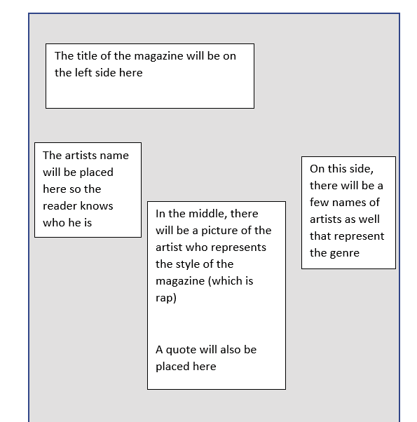
the front cover page will include:
- masthead
- barcode with price
- coverline
- website
- quote
- issue date
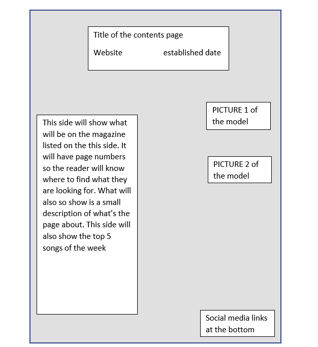
what will the contents page include:
the contents page will include page numbers
- website
- page numbers
- social media icons
- two pictures
- content that will be featured on the magazine
the feature page will include:
- 7 questions
- image
- quote
- title
this is currently how my front cover looks like.its a currently a draft and most definitely not my final piece of work. the picture of the model on the screen will be on my front cover and i will also be using another picture of him for the feature page
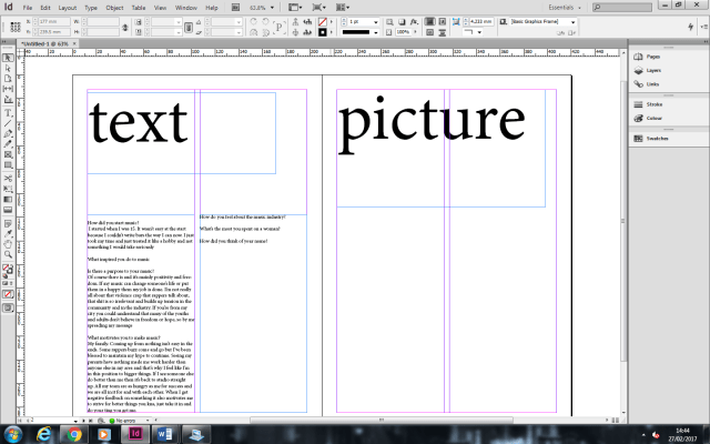
This is a rough draft of my feature page. the feature page has two pages and i will be putting my background image on the right side of the page
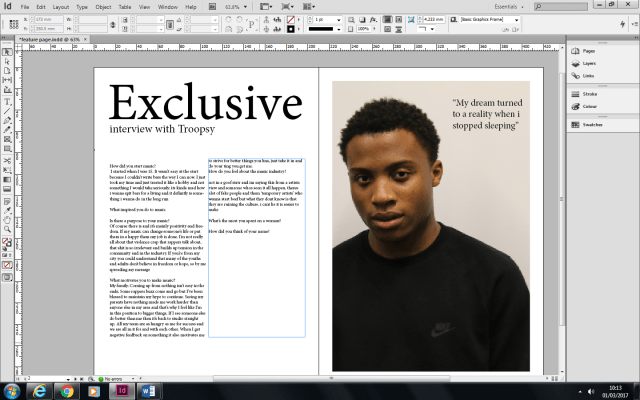
this is how my feature page is currently looking. as you can tell from the last screenshot, i have added a title and a picture. the current title that is displayed will not be the one i will be using because i will be using something more appealing to the audience. i will also be adding colour to the background so it doesn’t look plain.
Contents page:
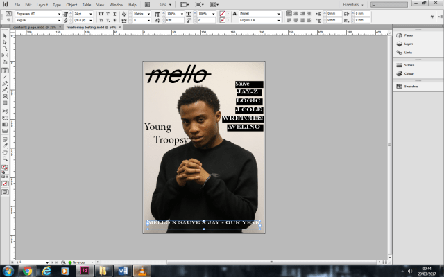
from looking at my front cover it looks very blank and alot of things are missing like the bar code and cover lines. at the moment it doesnt look very appealing and theres alot of things i need to change.

after making some changes i can definitely see a big change in my front cover. it looks much more professional than before and theres less space. I removed the song title at the bottom because I felt like it wasnt needed there. I also chnaged the font in some of the writing to make it look better and also incresed some of the font sizes. i also added the website and put it on the top right with the issue date before that.
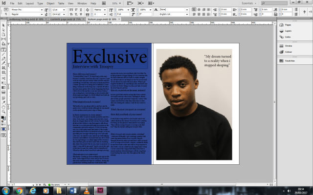 after looking at the feature page there were a couple of changes I had to make. I decided to change the background colour to black and change the font of the text to white. this makes the text easier to read and it matches the colors used in the magazine (black,white,light blue). another thing ive changed was changing the title of the feature page. this was because ‘Exclusive’ is too basic and it needs more of a flavour to it. I also increased the font size of the quote to make it bigger so its more likely to have a stronger meaning to the name and so it can cover much more space.
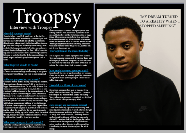 after making my changes I see a positive difference of the design with the feature page. the writing is much more clear and easier to read and so is the quote on the right side. the reason why I added a picture of the model was so the reader knows whos it about.
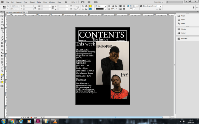
this is an incomplete version of my contents page. after reviewing my design there is a couple things I would have to input and change. one of the things I had to change was the title colour. the reason why I had to change it was so that I could make the title stand out so it looks more presentable and doesn’t look like normal text. another thing I would have to change is adding page numbers. This would help the reader locate the page of the topic and it makes it easier to navigate through the magazine so the reader wouldn’t get lost.
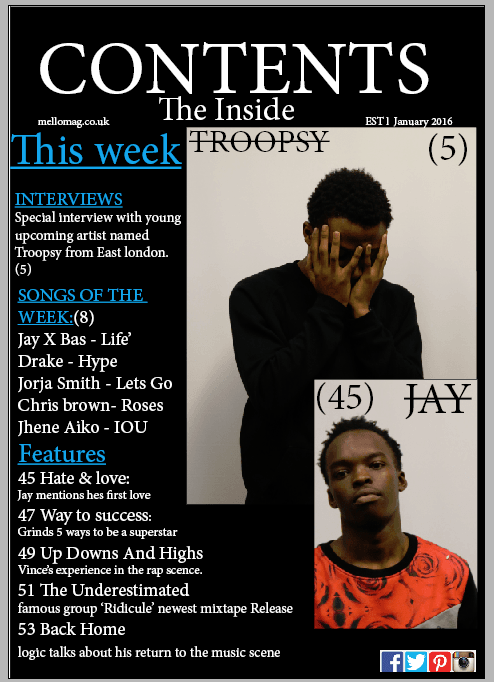
This is the final production piece of my contents page. I added the changes and I can honestly say I see a big improvement in change and design. the title stands out more and its more clear to see the title because its a different colour. I also added social media icons at the bottom so the readers know where to find more about MELLO MAG. near the top I also added the website link so the readers/audience can find more information and content of the magazine and what was also added was when the magazine was established. I wanted to use two images so it gives it more of a wider range and its about two people than just being focused on one artist. the sub headings are in bigger fonts with a small description. the reason why I done this was so that it gives a brief information on what the topic is about.

in the begging of starting my magazine this picture was going to be my front cover. the reason why i put this on my feature page was because i felt like this picture wasntr suitable for a front cover and the audience wouldnt be able to see my full appearence plus it would show that i have a shy characteristic

The reason why i decided to use this picture for my front cover is because is because its a straight portrait and its more of a front cover style more than the other picture .